Navigation Redesign at Fortune
Redesigned the website's navigation bar and hamburger menu in collaboration with UX and SEO teams, based on internal user testing and competitive analysis
Fortune is a global media company with a mission "to change the world by making business better." Just five years ago, Fortune launched Fortune.com and with that, expanded their business to the digital world. For six months, I worked alongside the Product team, learning the ins and outs agile development processes and gaining hands-on experience in the world of product.
As the lead designer and researcher, I worked closely with UX and SEO on a narrative-building UX research project aiming to uncover the subtle reasons behind low navigation click-through rates and to develop strategies to increase user retention on our site. I proposed these findings to stakeholders and senior designers.
Role
Product Manager and UX Design Intern
Timeline
Jan - June 2024
Tools
Figma
Jira
Adobe Suite
01
MOTIVATION
The problem
Our current navigation is confusing to use, inconsistent, and is not fully representative of all of Fortune's features.
Everyday, over a million people visit Fortune.com to discover the latest news in business. The digital experience is essential in adding to the reading journey to ensure that users keep coming back for more engaging and reliable content. Despite adding a hamburger menu, users rarely use it and are having trouble discovering features within Fortune.com and Fortune.com/Recommends.

Digging deeper...
Navigation Pain Points
To better understand what people at Fortune wanted to change, I reviewed existing study decks detailing specific navigation pain points identified by various teams at Fortune:
📰 Editorial
📹 Video Team
📊 Business Consumer Team
So with this information, I determined the goal:
Optimize our website's navigation to provide a seamless and efficient user experience.
02
UNDERSTAND
Reviewing Fortune's Current Navigation
Site Mapping
To understand the current landscape, I began by creating a detailed site map. This initial step allowed me to visualize the current layout and pinpoint areas in need of improvement, forming a solid foundation for the website's navigation redesign.
.fb68c1756bec9f598038.png)
How do navigations vary?
Direct Competitive Analysis
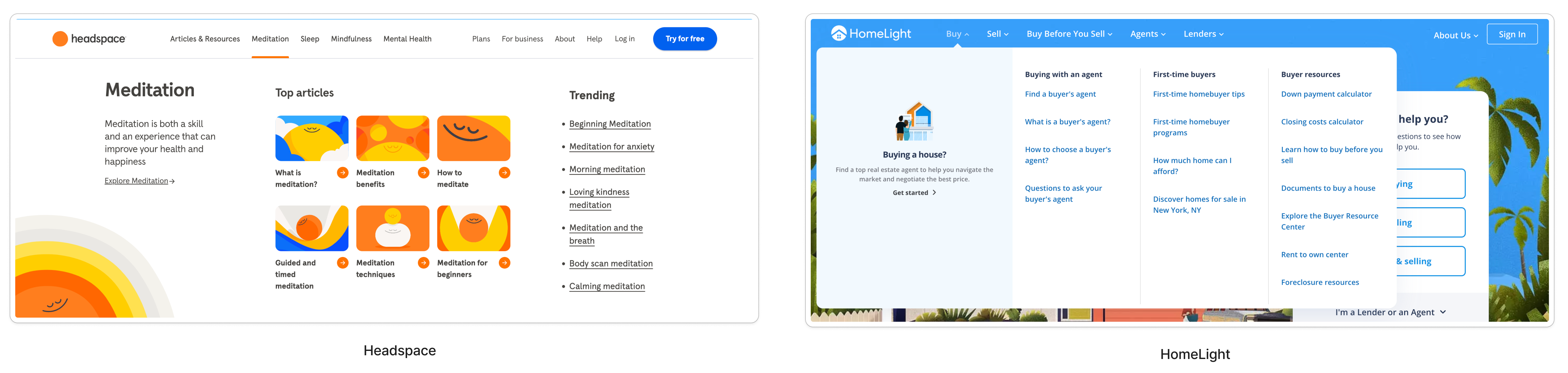
Next, I sought to better understand the mechanics of existing navigations systems through a competitive audit of 5 media companies. Each website serves a unique perspective on news, which means unique approaches to how they imagine navigation on their website. I conducted a competitive audit of navigation systems for 5 different companies, analyzing how each system performs contextually within the website Unfortunately, the full competitive analysis deck is under NDA.
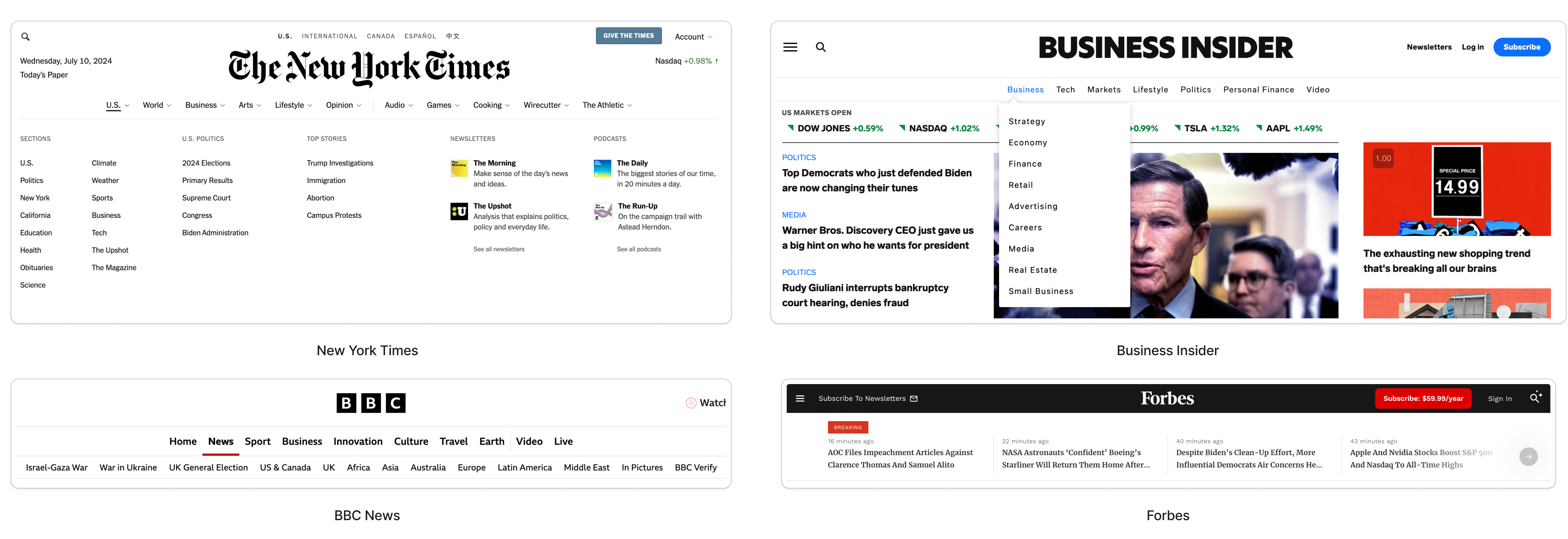
Indirect Competitive Analysis
And while direct competitors are the priority, I found it intriguing to examine the navigation of various startups to see where website design is heading. These navigation bars used out-of-the-box ideas that still proved to be extremely functional.
Research concluded that,
Fortune's presentation of information lacks clear highlights and can overwhelm new users, potentially leading to decision fatigue
Extensive scrolling is required to explore the full menu, impacting the user experience negatively.
By leveraging insights from this analysis, we can enhance the navigation to make it more intuitive, bringing awareness to key features and increasing accessibility.
Competitors utilize well-organized hamburger menus with distinct sections, enhancing usability by offering easy access to essential elements like search and account management.
03
IDEATION
Identifying Core Redesign Goals
Navigation Redesign Principles
After reviewing past research on the navigation and better understanding the competitive landscape, I generated a set of principles with SEO and UX to help guide my redesign of the navigation.
🔄 Consistency
Ensure the navigation menu is consistently placed across all pages, use clear and descriptive labels, and utilize universally recognized icons and symbols for common actions.
🌟 Visual Emphasis
Prominently feature products in the main menu, use appealing visuals, organize detailed sub-menus, highlight new and popular items, and incorporate interactive features
👥 User-Centric Design
Organize navigation items intuitively based on user research, ensure accessibility for all users, and design navigation that works seamlessly on all devices.
With these principles in mind, I proposed these
Final Design Recommendations
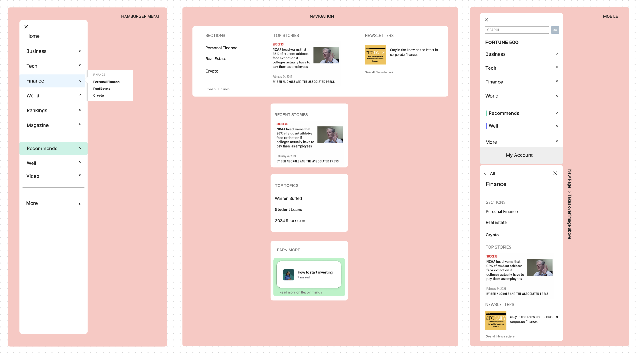
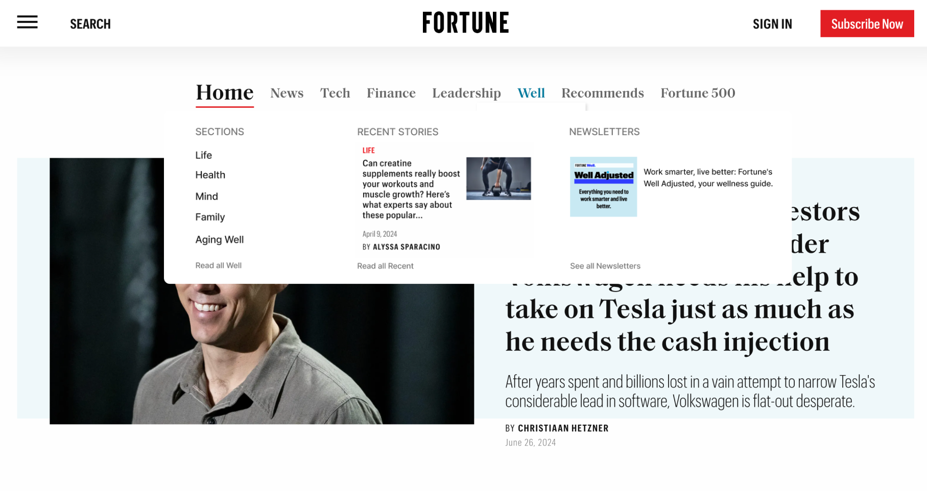
Before
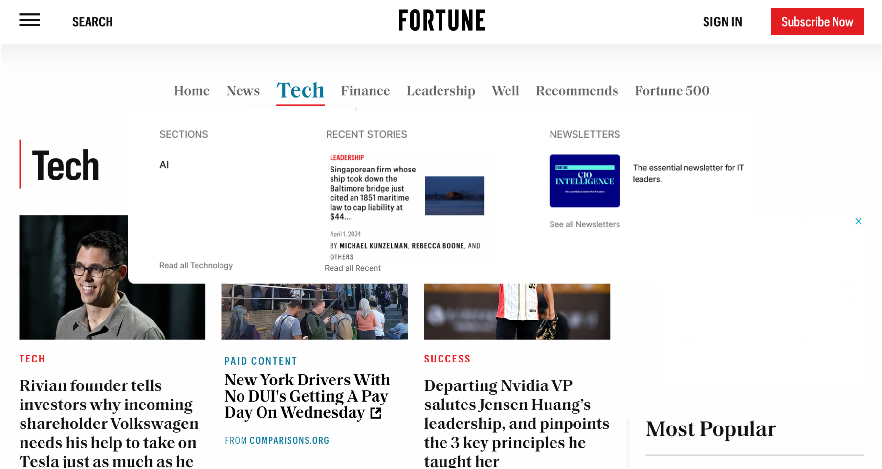
When hovering over 'News,' nothing appears, potentially confusing first-time users and leading to a less intuitive experience and lower retention rates.
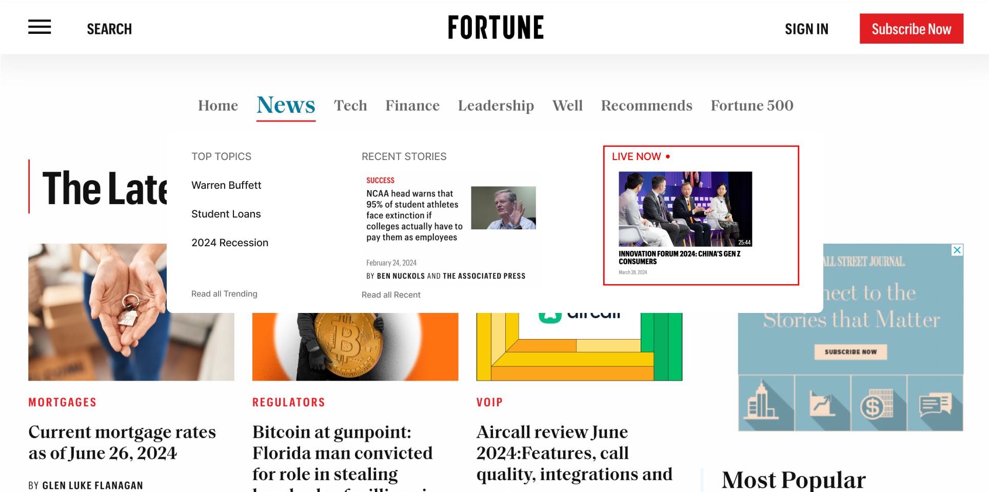
After
Including 'Top Topics', 'Recent Stories', and a 'Live Now' section in the navigation bar allows users to easily discover popular topics and engage with Fortune's latest events without leaving their current page.
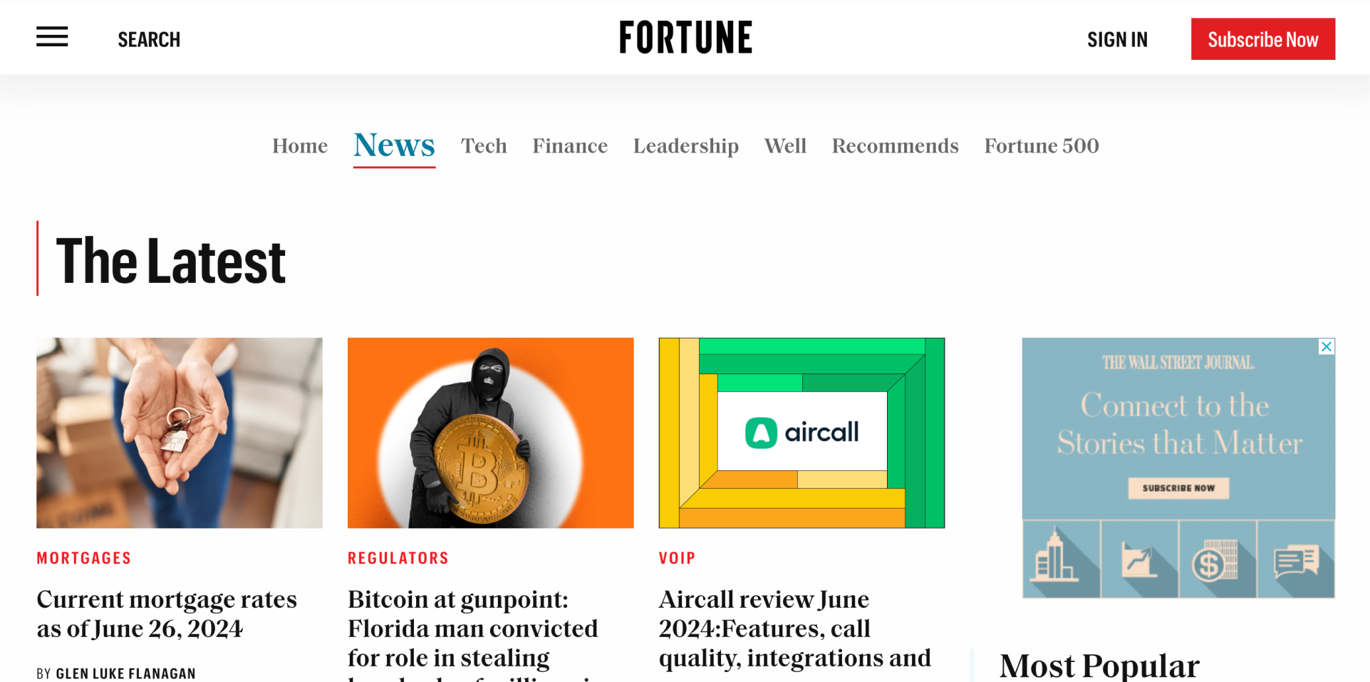
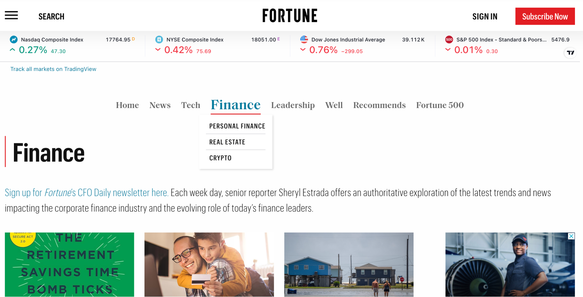
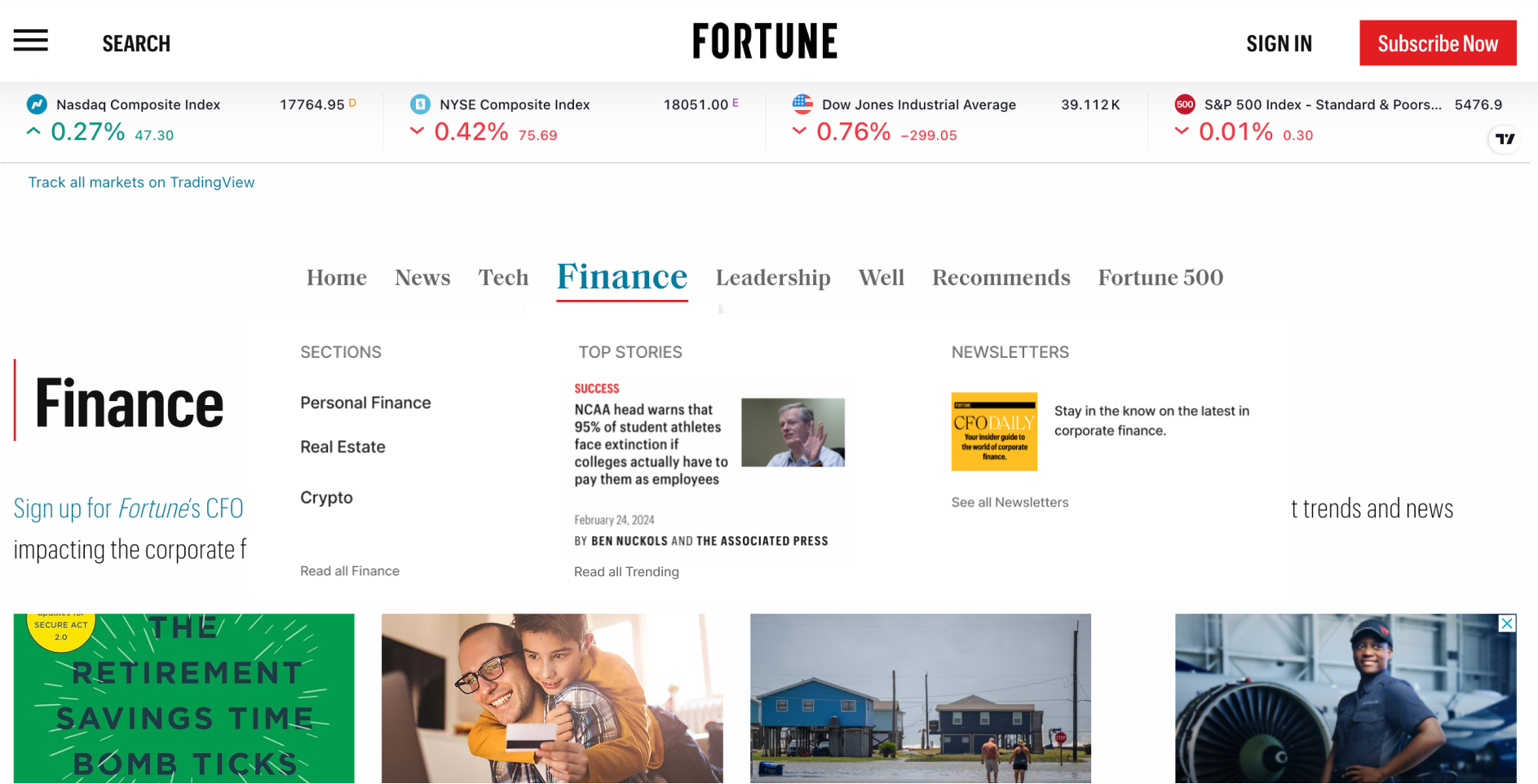
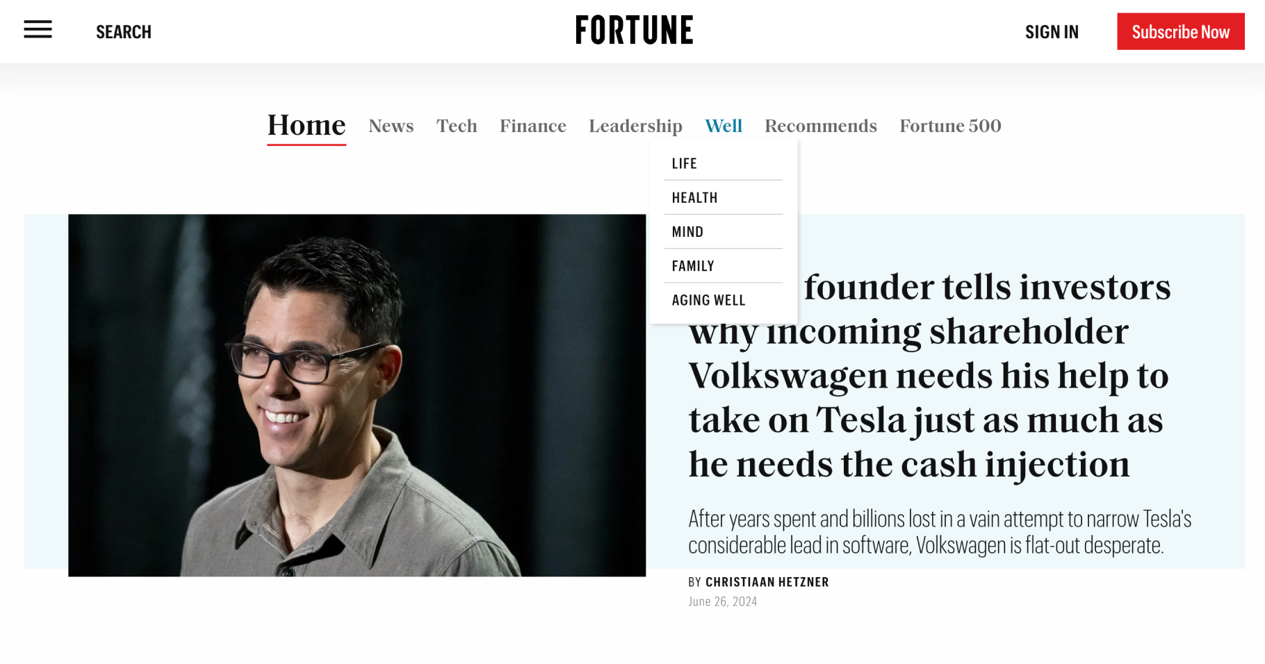
Before
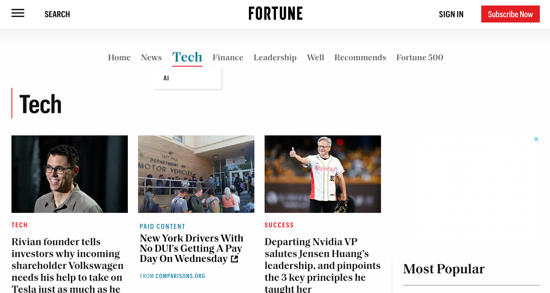
When users hover over 'Tech,' only one section appears, which is unconventional for most navigation bars.
After
Highlighting our newsletters related to the hovered topic could boost their visibility and increase subscriber numbers.
Before
After
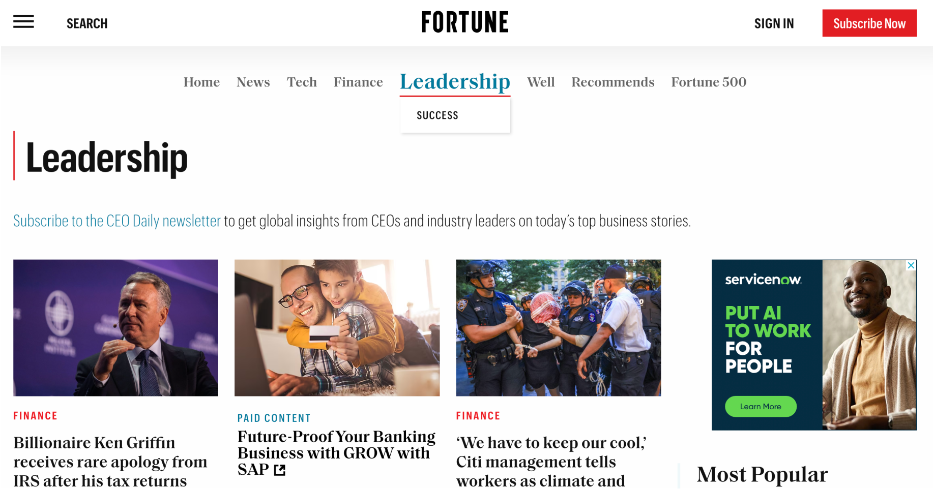
Before
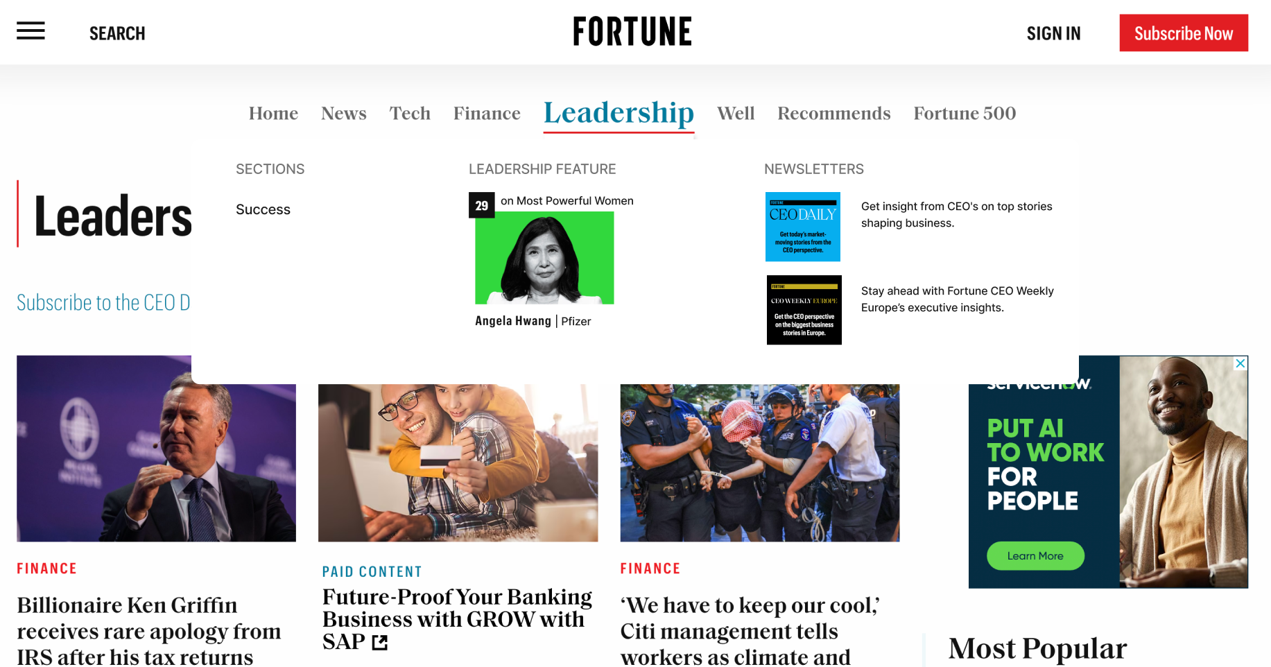
Like 'Tech,' 'Leadership' only has one topic that drops down when hovered over, which can be misleading.
After
Adding a 'Leadership Feature' can generate revenue by offering paid highlights. Additionally, it introduces users to our renowned lists, enhancing brand recognition.
Before
After
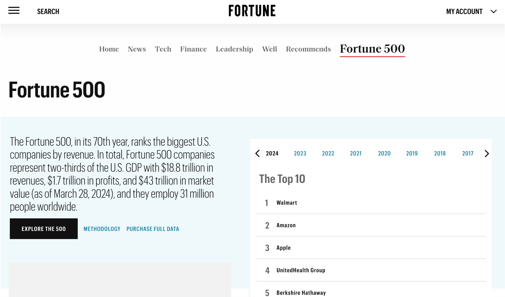
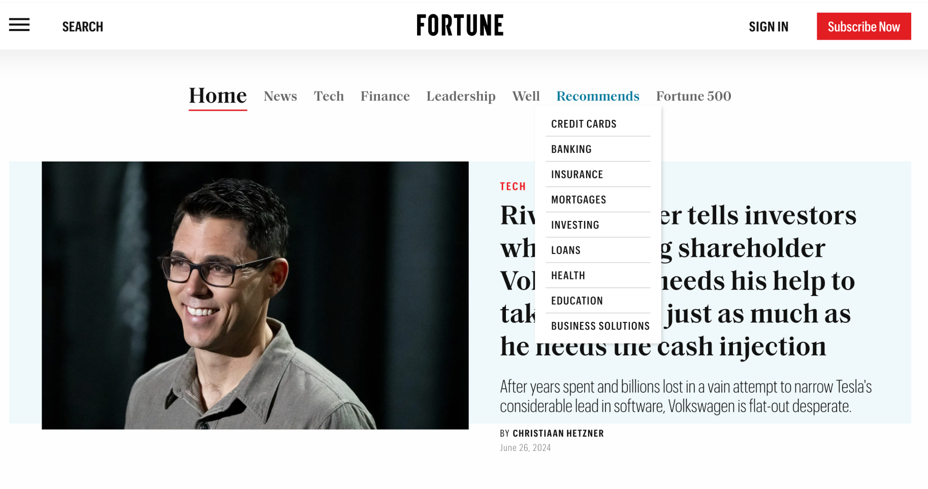
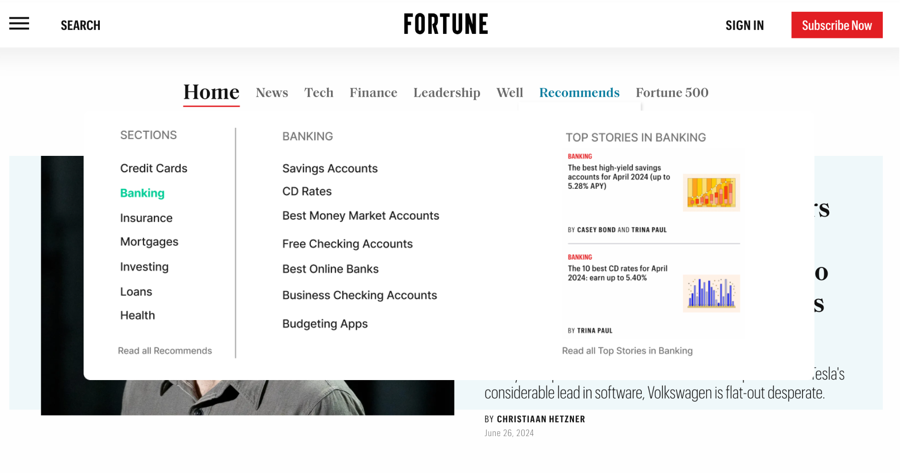
Before
Since Recommends is a brand under Fortune, its dropdown menu has many options, potentially causing confusion and decision fatigue. This design doesn't reflect the product well, and first-time users might not realize they will be redirected from Fortune.com.
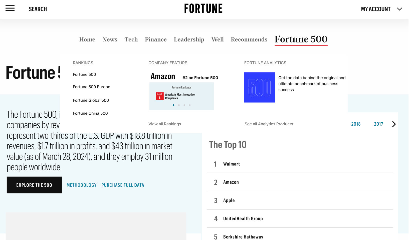
After
Redesigning the navigation to accurately showcase everything Recommends offers can give users a clearer idea of what to expect. This approach provides direct access to Recommends articles and enhances the brand's visibility.
Before
After